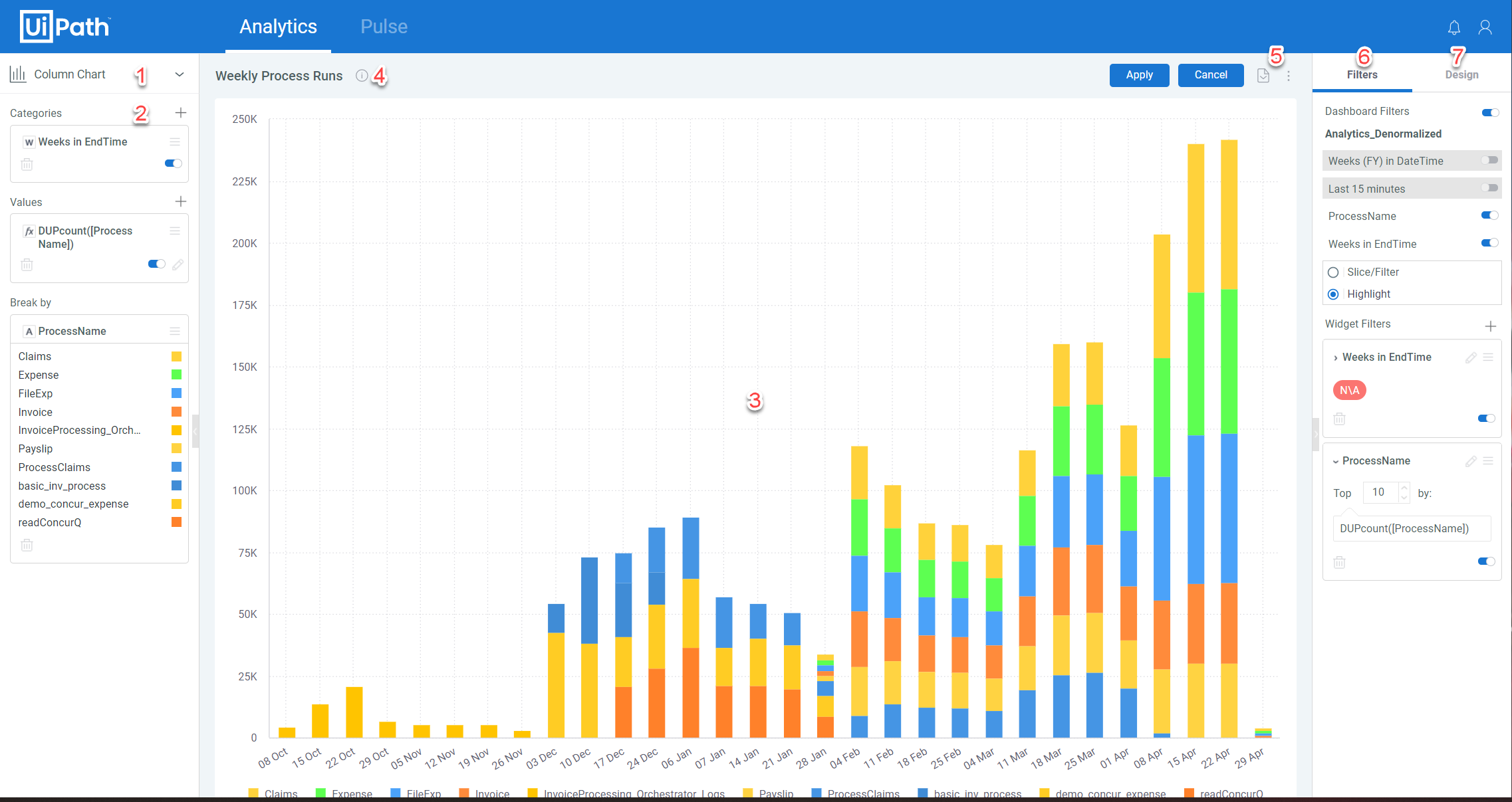
The widget editor enables you to fine tune your widget creation and design to achieve the most effective visualization for your analytical needs.
To reach the widget editor, select Advanced Configuration when creating a new widget or click the Edit Widget button of any existing widget.
Interface
The widget editor interface contains the following features:
- Visualization Selector - A drop down menu enabling you to change the widget type.
- Data Panel - Used for selecting the values to appear in the widget and those for grouping the data. Please note that the available options differ depending on the widget type selected.
- Display Panel - A preview of the current design and content of the widget. If Update on Every Change is toggled in the data panel, the display updates with every changed option, otherwise it updates only when you select Update.
- Title - Enables you to edit the title of the widget and add an optional description.
- More Options - Opens a menu with the following options:
- Save a Copy - Saves the current widget as-is and creates a copy.
- Selection - Enables you to select whether selections made in the widget affect the dashboard filters.
- Drill - Select whether to Enable Drill to Anywhere or not. If disabled, viewers may only drill down on the Hierarchies predefined for each value.
- Filter Panel - Enables you to add new widget filters or edit existing ones.
- Design Panel - Enables you to fine tune the widget appearance. Pleas note the available options differ depending on the widget type selected.
Forecasting
You can use the forecasting functionality to display linear, exponential, and logarithmic trend lines for your widget data, enabling you to predict future values based upon historical data.
Note:
Forecasting is only available for Column, Line, Bar, and Area widget types, and does not support:
Break by values.
Exporting of trend line data toCSV.
Stacked and Stack 100 widgets.
Forecasting is added from the widget editor, as follows:
- Add a new Value, or select an existing one, for which you want to add forecasting.
Note: We recommend duplicating this value so that the trend line appears on top of the existing values. - For the desired value, click the More Options button and select Regression. You can then select your desired regression type:
- Linear
- Exponential
- Logarithmic
Field Descriptions
Note:
The fields visible will vary depending upon the widget type selected.
The Data Panel
| Field | Description |
|---|---|
| Categories | The fields whose values will be placed on the X-Axis of the chart. |
| Values | The fields whose values determine the height of the Y-Axis. |
| Break by | Optional. Select a field by which to break that data represented in the chart. Please note that: Only one Break by field can be added. This option is only available when a single field has been added to Values. |
| Secondary | Applicable to Indicator widgets. The field whose name and value will appear as the secondary title and value in the widget. |
| Rows | The field(s) whose values will appear in the rows of the widget. |
| Columns | The field(s) whose values will appear in the columns of the widget. |
| Size | Applicable to Treemap widgets. The fields whose values determine the size of the rectangles. |
The Filter Panel
| Field | Description |
|---|---|
| Dashboard Filters | Toggle to determine if dashboard filters affect this widget. If enabled, all dashboard filters appear, enabling you to select individually which affect the widget or not. |
| Filter Behavior | The available options to determine how a widget behaves when filtered: Splice/Filter - only the selected categories remain visible, all non-selected are removed. Highlight - All categories remain visible but the selected ones are highlighted. |
| Add | Opens the Filter a Field window to create a new filter. |
| Edit | Appears on all existing filters in the panel. Opens the filter for editing. |
The Design Panel
| Field | Descripition |
|---|---|
| Legend | Toggle to determine if the legend is displayed and it's position. |
| Labels / Value Labels | Select which widget features are labeled, if any, and the label direction. |
| Area Type / Column Type | Select how areas/columns are represented in the widget. The available options are: Classic - Columns are displayed side by side. Areas appear in an overlap, with smaller areas in front and on top of larger areas. Stacked - Values appear on top of each other and do not overlap. Stacked 100 - Values appear on top of each other and do not overlap, with the combined values stretched to represent 100%. |
| X-Axis / Y-Axis | Enable or disable the following options: Grid Lines - Select whether the grid lines appear or not. Enabled by default. Labels - Select whether labels appear or not. Enabled by default. Title - Select whether or not the axis title appears and edit its content. Logarithmic - Display values using orders of magnitude. Values on Axis - Enables you to edit the default minimum, interval, and maximum values of the axis. |
| Auto Zoom | When enabled, automatically resizes the chart to include more data if the contents are more than can be displayed in one view. |
| Whisker values | Applicable to Box & Whisker Plot widget. The available options are: IQR - Interquartile Range, values are calculated within 1.5 times the difference between the first and third quartiles. Extrema - The values include the maximum and minimum in the calculation. Standard Deviation - The values are one standard deviation above and below the mean. |
Updated 2 years ago


